You have changed your resolution.

Refresh the page
🍪 Cookies, Anyone? Here's Our Promise!

Accept our cookies, and here's what we promise: You'll be seeing us a lot in our remarketing ads as you surf the web. Think of it as bumping into friends in the most unexpected places.

✔️ Sounds Good! I'm in for the journey. ✔️ Sounds Good! I prefer to keep things low-key
Global Concept Global Concept
Partly cloudy
Thessaloniki, Greece 10:46 PM
Thessaloniki, Greece
19°C Partly cloudy
Graphics & Branding January 08, 2024

The Psychology of Color: How we Utilize Color in Design

The Psychology of Color: How we Utilize Color in Design

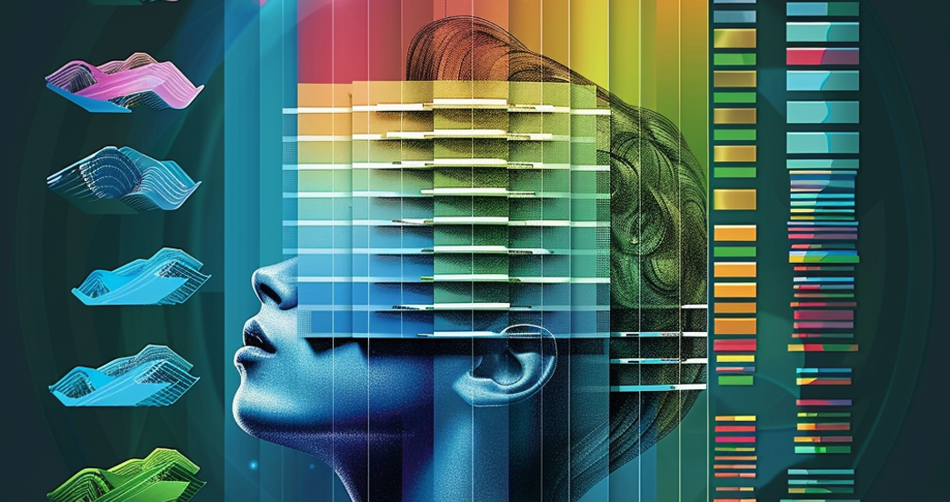
Color is an incredibly powerful tool in the realm of graphic design. It can evoke emotions, attract attention, and even influence behavior. At Global Concept, we take the psychology of color seriously. Understanding how color can impact perception and action allows us to design visual experiences that resonate with audiences and align with our clients' goals.

Understanding Color Psychology

Color psychology is the study of how color influences our perceptions and behaviors. Each color can evoke different emotions and associations. For example, red is often associated with passion and urgency, while blue tends to represent calmness and trust.

Understanding these associations allows us to use color effectively in our designs. However, we recognize that context matters. Cultural differences, personal experiences, and the overall design can influence how a color is perceived.

How We Use Color Psychology at Global Concept

1. Brand Identity: We carefully choose colors that convey the emotions and values at the core of a brand's identity. For example, if a brand values innovation and excitement, we might lean towards bold, vibrant colors.

2. Audience Engagement: We also consider our target audience's preferences and perceptions. Knowing what colors resonate with an audience allows us to design more engaging and effective visual experiences.

3. Visual Hierarchy: Color can be used to guide viewers' attention and establish a visual hierarchy. We strategically use color to highlight key elements and guide the viewer through a design.

4. Call to Action: Colors can influence behavior, making them a powerful tool in calls to action. We use color to make these elements stand out and incite action.

Color and Beyond

At Global Concept, we view color as one piece of the design puzzle. While color is powerful, it's most effective when used in combination with other design elements, like typography, layout, and imagery.

We always aim for a balance, ensuring that our use of color supports the overall design and communication goals, rather than overwhelming them. This approach helps us create designs that are not only aesthetically pleasing but also purposeful and effective.

Conclusion

In the world of design, color is far more than just a visual element. It's a potent tool that can stir emotions, guide attention, and even prompt action. At Global Concept, we harness the power of color psychology, weaving it into our design process to create visual experiences that captivate and connect with audiences. Through understanding and leveraging the psychology of color, we're able to create designs that go beyond aesthetics and speak directly to the human experience.

Let's embark

on your digital transformation journey.

Start your project